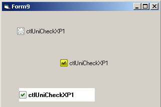
ctlUniCheckXP Control
Checkbox with Unicode text and tooltip (Windowed)
Check the [ctlUniCheckWL] control for a Windowless version
Check common properties here
Enums
| Name | Description |
|---|---|
| eUniCheckXp_align | Checkbox alignment constants |
Events
Properties
| Name | Type | Description |
|---|---|---|
| Align | (eUniCheckXp_align) | Gets or sets the alignment of the control |
| BackColor | (OLE_COLOR) | Gets or sets the Background color of the control |
| BorderColor | (OLE_COLOR) | Gets or sets the Border color |
| Caption | (String) | Gets or sets the Text of the control |
| CheckBackColor | (OLE_COLOR) | Gets or sets the Background color of the check button |
| CheckForeColor | (OLE_COLOR) | Gets or sets the check mark color |
| Enabled | (Boolean) | Enables or disables the control |
| Font | (Font) | Gets or sets the font used for text in the control, check the [ApplyFontChanges] for details |
| ForeColor | (OLE_COLOR) | Gets or sets the Text color |
| MouseIcon | (Picture) | Gets or sets the MouseIcon for the control |
| MousePointer | (VBRUN.MousePointerConstants) | Gets or sets the MousePointer for the control |
| OLEDropMode | (eCtlOLEDropMode) | Gets or sets the OleDropMode for the control |
| Pressed | (Boolean) | Same as [Value] but uses a Boolean, represents the state of the control, True = Checked, False = Unchecked |
| RightToLeft | (Boolean) | Gets or sets the ability to show bidirectional text on the control |
| ShowFocus | (Boolean) | If True, draws the focus rectangle when the control gains the keyboard focus |
| Style | (eCtlButtonStyle) | Gets or sets the control style |
| Tip | (String) | Gets or sets the Unicode Tooltip for the control |
| Value | (Integer) | Same as [Pressed] but used an Integer like the original VB6 control Represents the state of the control, 1 = Checked, 0 = Unchecked |
Methods
| Name | Type | Description |
|---|---|---|
| ApplyFontChanges | When setting a new font on the control you need to call this function in order to refresh the interface | |
| hWnd | (Long) | Returns the internal handle of the control |
| OLEDrag | Starts an OLEDrag operation |
Remarks
